- News
- Reviews
- Bikes
- Accessories
- Accessories - misc
- Computer mounts
- Bags
- Bar ends
- Bike bags & cases
- Bottle cages
- Bottles
- Cameras
- Car racks
- Child seats
- Computers
- Glasses
- GPS units
- Helmets
- Lights - front
- Lights - rear
- Lights - sets
- Locks
- Mirrors
- Mudguards
- Racks
- Pumps & CO2 inflators
- Puncture kits
- Reflectives
- Smart watches
- Stands and racks
- Trailers
- Clothing
- Components
- Bar tape & grips
- Bottom brackets
- Brake & gear cables
- Brake & STI levers
- Brake pads & spares
- Brakes
- Cassettes & freewheels
- Chains
- Chainsets & chainrings
- Derailleurs - front
- Derailleurs - rear
- Forks
- Gear levers & shifters
- Groupsets
- Handlebars & extensions
- Headsets
- Hubs
- Inner tubes
- Pedals
- Quick releases & skewers
- Saddles
- Seatposts
- Stems
- Wheels
- Tyres
- Health, fitness and nutrition
- Tools and workshop
- Miscellaneous
- Buyers Guides
- Features
- Forum
- Recommends
- Podcast
feature
What's the best way to set up your bike computer? How to get the best data on screen for your riding
Got a new cycling computer, or just not sure if your setup is right? It can be difficult to choose exactly what metrics you need to have in front of you to maximise the functionality of your cycling computer, so we're here to help you decide the best way to set it up for the types of riding you do.
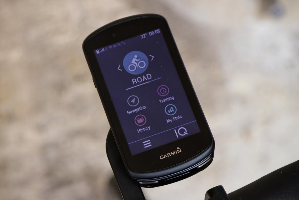
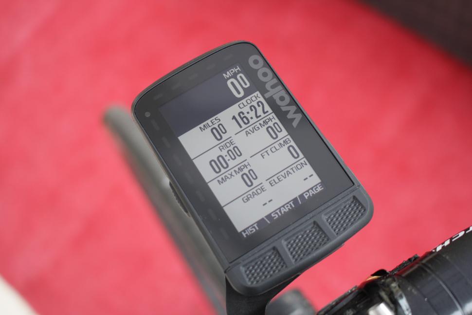
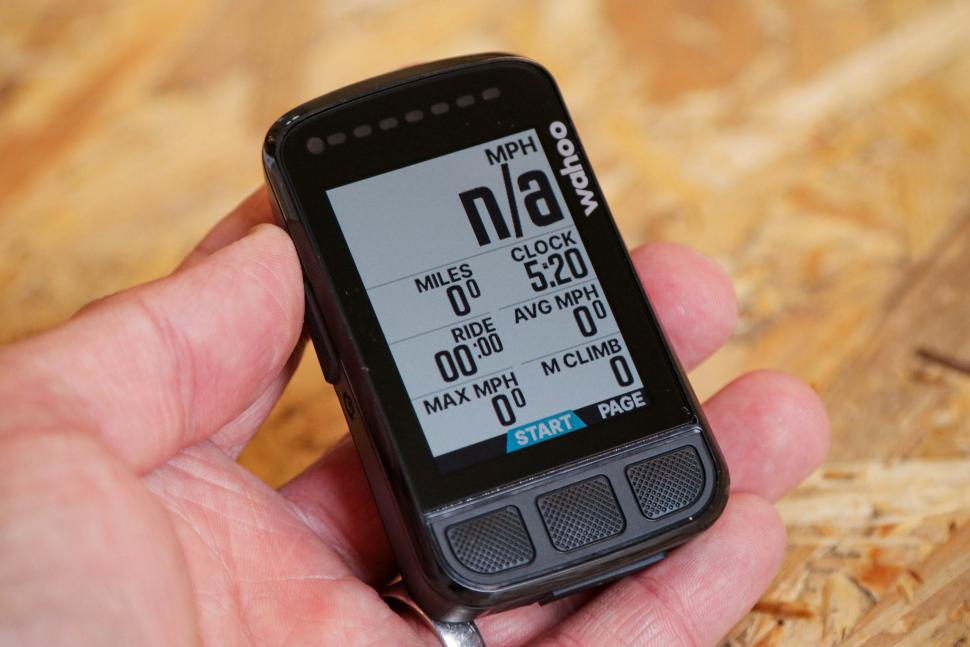
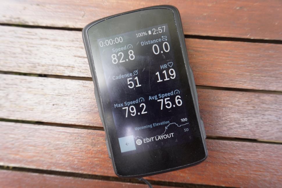
Whether you use a Wahoo, Garmin, Hammerhead, or any other kind of cycle computer, the initial setup of activity screens can be a daunting prospect. On many devices such as Garmin’s this is commonly done on the device itself, whereas with a Wahoo this can only be done using the companion smartphone app, so the process can be a little different.
The tips that we go through here will apply to the majority of bike computers, but our example head units for the purposes of this feature and video are Garmin, Wahoo and Hammerhead, to tick off three of the most popular computers out there at the moment...
Activity Profiles
Before we dive into what data you want to see, you might want to set up different profiles for different bikes. Some devices allow for multiple activity profiles, so if this is the case the first thing you’ll need to do is decide whether you’re going to go for a one-size-fits-all approach, or use alternative profiles depending on the type of ride. For example, you might like to look at different information when riding inside vs outside, or for road riding and mountain biking, or have slimmed down screens for races and time trials.
If you want to have different profiles for various bikes, then start by setting up pages for your main bike and then move onto your other bikes.
How many data fields?
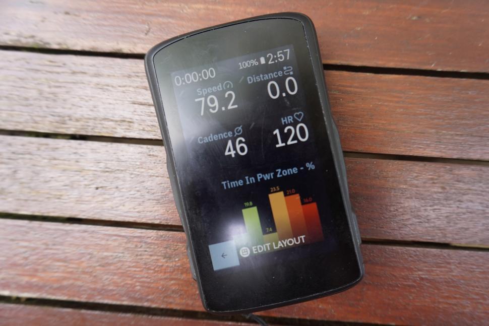
The number of data fields that you cram on a single page will depend a lot on how big your device is and also how good your eyesight is. For example, if you generally use quite a large bike computer, you might have five data fields but if you have a smaller computer, go with three as it makes the fields bigger.
On a Wahoo you can change the number of data fields on the fly but you’re still going to have a favoured degree of zoom that shows just your favourite data. Realistically, using the maximum of 11 or so data fields on your main screen just isn’t the way to go. The numbers will be tiny, it’ll take longer to read them, especially when your bike is bouncing around and your eyes won’t be looking where you’re going which is never a good thing.
> Get to know the Garmin Edge GPS bike computer range
It’s a completely personal preference but we think a good starting place is for those of you with good eyesight or big computers to use 5 or 6 data fields. If you’ve got a medium-sized computer and decent eyesight then go with 3 or 4 and for anyone with poor eyesight or a small computer then go for 2 or 3 data fields.
The main screen
This is going to be the screen that you look at for the majority of a ride, and it might be the only one that you want to set up if you’re not bothered about data that much. This means you need to fit as much useful information onto it as possible, while also making it easily readable. Let’s take a look at some of the most popular data fields to include on this page.
Timer - This one sounds self-explanatory, but it’s easy to get confused between the timer, elapsed time, moving time and all the other times come to think of it. Unlike the elapsed time, the timer will only keep ticking whilst the activity is running; for example, if you turn on auto-pause then the timer will stop when you’re not moving. We recommend using the timer as it shows the actual time you’ve been pedalling for and not how long you’ve been out of the house, sat at the pub.
Distance - Distance is simple, decide whether you want it shown in kilometres or miles and you’re good.
Current heart rate - Only add this one if you actually own and use a heart rate monitor. Whether you’re doing specific training to heart rate zones or just want to check out how much deeper you can go, this is a great one to have on your main screen. Just don’t make it so big your riding buddies can look over and see how much effort you’re putting in...
Current Power - Once again, only add this if you actually use a power meter. Your current power reading is a great way of measuring your effort, so is useful to see at a glance. We recommend going for 3-second average power as this gives a reliable reading, is impacted less by what part of the pedal stroke you happen to be at when you look down, and is still a short enough duration to know what you’re currently doing.
Current speed - Once again choose your preference of km/h or miles per hour. Besides telling you how fast you're going, it can help you stop surging on group rides or just add a bit of motivation when heading out solo.
Cadence - Cadence tells you how many revolutions of the pedals you're doing per minute. If you’ve got a bit of a habit of spinning your legs a bit slow then putting cadence on your main screen can be a little kick up the backside to change gear and get those legs turning at a more efficient speed.
> A closer look at the Hammerhead Karoo 2
So those are the common metrics for the main screen. Some devices, like the Garmin Edge 1030 Plus, allow you to have one more prominent metric, which is helpful if you regularly check one in particular. Remember to sub in data that is relevant to your riding if the metrics that we’ve suggested aren’t useful to you.
Secondary Screens
Next let’s take a look at some data fields which might not quite make it onto your main screen, but that you might still want to have a look at during the ride. Of course, if any of these feel really important then feel free to bump them up to the main page, it’s your computer after all!
Average speed
This is the distance you’ve travelled divided by the moving time. Lots of people like to look at this later on in a ride and try and keep their speed above whichever number they happen to choose.
Time of day/Clock
If you’re a commuter or are particularly scared of your partner then this one‘s probably worth putting on the main screen. You could sit this next to the scheduled sunset as, on those lovely summer evening rides, you can then easily judge how much daylight you’ve got left.
Climbing Data
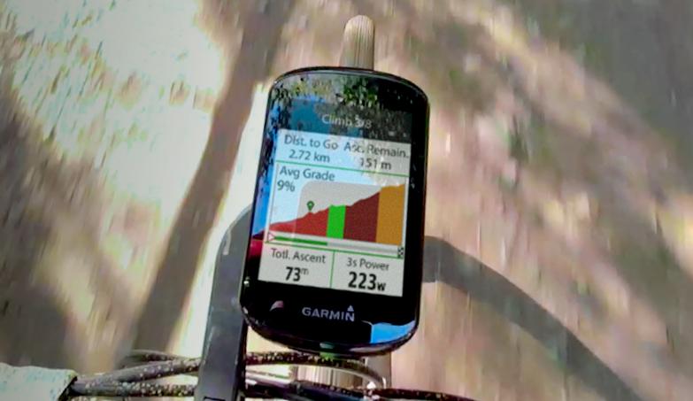
For riders who love a bit of climbing, you may also want to add some stats such as the current gradient. Some devices allow for a whole specialist climbing page, so you could add them to that alongside a pretty elevation graph if that tickles your fancy. Garmin (the higher end ones) and Hammerhead computers both have clever pages that will pop up with the profile of any significant climbs if you’re following a route. It’s an excellent way to pace a climb, but you can turn it off if it just sends you into a pit of despair.
Elevation gained
This is the cumulative height you’ve gained during your ride, if you climb 10 metres and then descend five metres then your elevation gained will still be 10 metres. If you then go and ride up another 10-metre high hill then it’ll now read 20 metres, and then you can play top trumps with your stats at the cafe.
Temperature
You can take a picture of it for your Instagram story to show how freezing it is, or celebrate the one week of British summer.
TSS
This stands for training stress score. That one is only really useful if you either have a coach telling you what numbers to hit, or if you like geeking out on Trainingpeaks or similar software.
Battery levels
For example, a Di2, eTap or the computer’s battery. They all last a long time between charges, so watching the numbers tick down is great if you also enjoy watching paint dry. The key for us is to have a quick reminder that we need to do a recharge.
Power meter users
If you don’t own a power meter then feel free to skip through this section, but if you are the proud owner of one, then setting up some specific data fields is really going to help you get the most out of it on rides. We’ve already included a current or 3-second average field on the main screen so let’s discuss what else we can add.
It can be a good ideal to give yourself a whole page dedicated to just power for when you're training. At the top of it, you could have your 3-second average power. You might also benefit from seeing lap average power as you might need to hit a particular number for that lap.
> Cycle computers - everything you need to know
Normalised power is very similar to Strava’s weighted power calculation and gives a value that is representative of the entire activity at a constant wattage. This is really useful if you do punchy rides where the intensity keeps changing as your average power might be lower than you'd expect.
You might also want to add some max power fields. These allow you to check out your peak performances from the current ride before you click stop and end it. These are always great for a bit of friendly competition with riding buddies. On a Wahoo, you can see max 3-second and 20-second power for sprints and then 1, 5, 20 and 60-minute power bests for longer efforts.
Map Screen
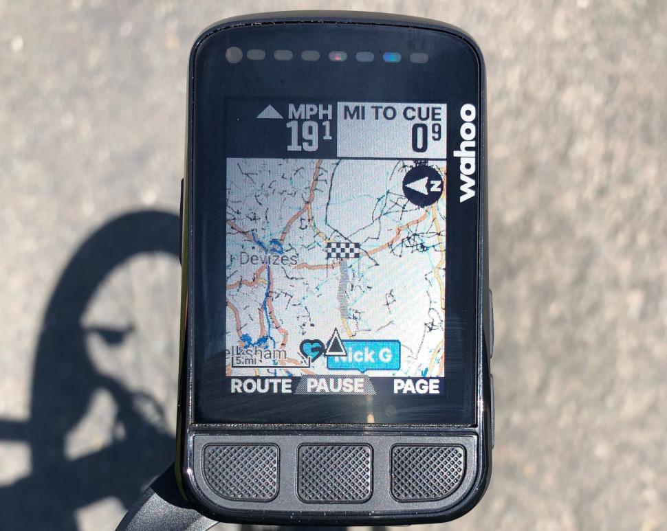
So we’ve now got two or three different pages with loads of useful data on them. After that, some people like to have a map screen permanently on, whereas others like it to only appear when they’re following a route. With newer devices, it’s also possible to see some other riders' locations on the map, which is useful if you’ve got riding buddies that like to get lost a lot. At the bottom of the map screen on some devices you can have a couple of data fields, which can allow you to keep an eye on key metrics.
For gravel and off-road riders we recommend always keeping the mapping on, even when not following a route, as it can help you to locate the entrances to bridleways and tracks. The same can be said when riding abroad, a map can help you safely navigate alpine descents by showing you where the tight corners are. It’s genuinely incredibly handy as some of those corners are blind.
For smaller computers we recommend not putting any additional data fields on this map screen, as it will reduce the size of the map, thus making it harder to see and follow courses.
Lap screens
The final page you might want to set up is the lap screen which, as the name suggests, is quite good for doing laps. Laps are useful not just for when going round in circles, but for breaking up an activity into distinct parts; for example, different efforts or intervals and then analysing them post-ride.
For the lap screen, we recommend making it quite similar to your main screen but instead of the ride timer, it’s going to be replaced with the lap timer. Make it nice and big so you know how long you've been doing this particular part of the ride. If you’re using a power metre you’re then likely going to want to see lap average power and if not then it’s likely you’ll want lap average heart rate instead or maybe lap average speed. You just need something against which you can regulate your effort.
> Wahoo Elemnt Bolt vs Garmin Edge 530 - which is best?
If you regularly do lots of laps then it might be useful to also include a lap counter to keep track of how many you’ve done, though this does usually flash up each time the lap button is pressed.
Remember, if you find that after a few rides you’re not using a data field... then get rid of it! Let us know which data fields are your favourites and why down in the comments below.
Latest Comments
- eburtthebike 0 sec ago
It was only a cyclist, so at least 50% their fault for being on the road in front of a car.
- stonojnr 12 min 41 sec ago
True, fwiw they're half decent round my neck of the woods, but I appreciate having travelled around the UK via train, it ain't always so good...
- PRSboy 14 min 16 sec ago
"Mitigating on behalf of the defendant, and addressing her failure to stop, Foster’s barrister said: “This is a young woman who was in shock by the...
- Legin 1 hour 18 sec ago
The tory party will oppose anything that might restrict their tanks rolling at the next election.
- EraserBike 1 hour 5 min ago
I'm sure this (and other 3D printed models) are made where labour costs are cheap also. Nobody is making these in Europe. There's only so much ...
- mdavidford 1 hour 31 min ago
Especially since the similarly priced Tickr X did have that functionality.
- anke2 2 hours 11 min ago
CX is brutal in terms of forces acting on the chain. A single, technical kick at 40 RPM by Iserbyt with a small chainwheel might put more load on...
- Andrewbanshee 2 hours 48 min ago
I experience this quite often when out running. I follow the guidelines, running towards traffic and keep hard right. I am very visible too but...
- mctrials23 3 hours 2 min ago
Not enough to warrant having the role exist at all would be my guess.
Add new comment
8 comments
I use two computers.... a Garmin Edge Explore which I only use for Maps and a handlebar mounted Garmin Fenix watch for data (speed, distance, time). I get all the info I need without flipping through screens. If I wanted to, I could use a data screen on the Explore, or a second data screen on the fenix for things like heart rate, cadence and power. But I have a pretty good idea of what's going on there anyway.
The good thing about this set up, is that both devices cost less than a Garmin Edge 1030 and between them, offer more functionality. I save the gpx track from my Fenix as this also supports barometric altitude and power meter (neither supported on the Explore). I also have Di2, and can set this up to flip through screens on my Fenix (not the Explore).The money I saved from not buying the 1030 paid for my Fenix watch, which I can also use for other sports such as running & golf.
For those with Di2, showing the rear gear in the x/11 format is very helpful on the main screen, especially for a commute activity profile. It makes getting in the right gear before coming to a stop at traffic lights a bit easier. Adding Di2 Battery Life and Garmin Battery Life on a secondary screen are also helpful (although for reasons I simply don't understand, some genius at Garmin decided, in the most recent device "update", that a graphical battery picture with 4 bars was a superior indicator to a percentage value !)
I found that the Elemnt Bolt was a little bit laggy when using bluetooth to talk to Di2, so got an MT800 display that reliably shows the gear immediately (and battery life in bars).
Worth spending a bit of time getting this done, this is what I have on the road activity profile on my Garmin Edge.
Mine is much, much simpler. I have an instant screen and an aggregate, plus map. Instant: cadence, HR, speed, gradient, temperature. Aggregate: distance, average speed, total elevation, clock, temp and gradient. The latter three are out of place on the aggregate screen but I'm nervous of ice and awful at climbing so like to know if my agony level is justified... And I don't want my partner to worry if I'm going to be late, so text every hour or so when riding solo.
Sounds a lot like mine, but in reverse. And I have the clock and total distance on the map screen, to help me plan in lunch stops before the pubs and cafes close.
I suspect the 'perfect set-up' will look very different for different use cases - are you primarily using it for navigation, as a training aid, to chase KOMs, just to record the ride to look at later, etc., etc.?
Dead right, mostly navigation and casual recording, with HR to reduce the chance of expiry before the top of a hill. For a while I had HR and speed on the map as I did a few virtual TTs in lock down, but that wasn't always enough to prevent last place or dnf for not following the route...
Like every other rider of my talent, the key for KoMs is the wind direction and all I need for that is a weather forecast with a gale in it.
Thank you for sharing your screens, very useful