

- News
- Reviews
- Bikes
- Components
- Bar tape & grips
- Bottom brackets
- Brake & gear cables
- Brake & STI levers
- Brake pads & spares
- Brakes
- Cassettes & freewheels
- Chains
- Chainsets & chainrings
- Derailleurs - front
- Derailleurs - rear
- Forks
- Gear levers & shifters
- Groupsets
- Handlebars & extensions
- Headsets
- Hubs
- Inner tubes
- Pedals
- Quick releases & skewers
- Saddles
- Seatposts
- Stems
- Wheels
- Tyres
- Tubeless valves
- Accessories
- Accessories - misc
- Computer mounts
- Bags
- Bar ends
- Bike bags & cases
- Bottle cages
- Bottles
- Cameras
- Car racks
- Child seats
- Computers
- Glasses
- GPS units
- Helmets
- Lights - front
- Lights - rear
- Lights - sets
- Locks
- Mirrors
- Mudguards
- Racks
- Pumps & CO2 inflators
- Puncture kits
- Reflectives
- Smart watches
- Stands and racks
- Trailers
- Clothing
- Health, fitness and nutrition
- Tools and workshop
- Miscellaneous
- Buyers Guides
- Features
- Forum
- Recommends
- Podcast
news
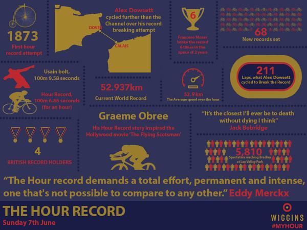
 Team Wiggins Hour infographic
Team Wiggins release Hour infographic - but Sky not impressed at "blatant rip-off"
With a fortnight to go until Sir Bradley Wiggins attempts the UCI Hour record at the Lee Valley VeloPark in London, Team Wiggins has released an infographic charting the history of one of the hardest feats in cycling. But Team Sky, which Wiggins rode for until last month, aren’t happy about it, pointing out how similar it is to their own infographics.
With Team Wiggins sharing many of the same sponsors as the WorldTour outfit – Pinarello, Rapha, Jaguar, and Sky itself – some might assume that they were the work of the same designer, and that the Hour record infographic was meant to be similar in style to earlier Team Sky ones.
Not so, says Nick Howes, digital manager at Team Sky, who described it as a “blatant rip-off” when he tweeted the two infographics side by side earlier today.
I've never seen a more blatant rip off of Team Sky Infographics than this from @OfficialWIGGINS! #SpotTheDifference pic.twitter.com/ezve3vQh7V
— Nick Howes (@TeamSkyNick) May 26, 2015
Here they are so you can judge for yourself.
Granted, there are only so many ways you can present this type of information, but Howes does seem to have a point. Both have a dark background, with text in colours mainly based on the respective teams’ kit, plus a splash of pink and the Italian tricolore flag for Sky.
Both use a similar font and style of graphics, and the positioning of the title at bottom right and team logo, bottom right, is identical.
Scott O’Raw of Velocast was among those who were surprised at Howes’ tweet, with the Team Sky staff member explaining his opinion to him.
@velocast @OfficialWIGGINS nope, absolutely not. We worked hard on those as well. Poor, poor form
— Nick Howes (@TeamSkyNick) May 26, 2015
Not everyone had a problem with it, however.
@TeamSkyNick @OfficialWIGGINS Hardly a unique idea, putting info into a collage! Given what Wiggo gave to @TeamSky you shd be happy to share
— Linda Billett (@Thehenlady) May 26, 2015
The Hour record is currently 52.937km and is held by Alex Dowsett of Movistar, who set it at the start of this month in Manchester.
Wiggins’ attempt on it takes place on Sunday 7 June and will be broadcast live by Sky Sports from 6pm-8pm – including free on its YouTube channel – with the ride itself starting at 6.30pm.
Latest Comments
- Terry Hutt 3 hours 37 min ago
I assume you can carry an e-bike battery on the tube if you leave the bike at home. ...
- chrisonabike 4 hours 39 min ago
I love it - it's a roundabout with a sculpture of a roundabout on its desk!
- cmedred 4 hours 40 min ago
From the position of the cyclist when the video starts and the position of the bike later, it looks highly unlikely that the cyclist went "into the...
- Rendel Harris 4 hours 46 min ago
To rhyme with design. I wondered this myself so looked it up a while ago, according to the founder Micki Kozuschek he and his team had a few...
- Rendel Harris 5 hours 39 min ago
It's not being pedantic at all, careless driving is successfully prosecuted (and I have been in court more than once when a driver has been...
- HLaB 6 hours 3 min ago
It's hopefully an urban myth but I heard it was designed that way on purpose, so the cyclepath captured any flooding and the busway would remain clear
- mdavidford 6 hours 5 min ago
I should imagine eating chopsticks anywhere could be potentially rather perilous.
- Rendel Harris 6 hours 24 min ago
When The Badger stopped for protesters (albeit dockworkers rather than farmers) it was their stress gauges rather than his that would have been...
- Eurodolphin 7 hours 9 min ago
Having experienced a brain injury (while my helmet only suffered a little crack) I welcome all this excellent research which looks for ways to...
- mattw 7 hours 12 min ago
Nope. Has anyone ever bought a wheel trim studded with diamonds for their car? Thought not.
Add new comment
41 comments
A simple case of someone feeling more important than they are, and feeling what they do is more important than it is.
I imagine the balance may have been restored now!
Whats allllll this about
postscript: He's deleted the tweet.
I would have sent them both back...
It's different only slightly similar layout, by team Sky complaining it got more attention
Diddums
This is the same Sky that won a court case against Microsoft because it has/had a product called Skype and Sky Drive.
The presumption is that anything to do with the word Sky is now for sole use by Rupert Murdoch
...so is it any wonder they'd get in a flap over an infograph about cycling.
See you in court Wiggins!
there are time that not giving a penny to Sky seems to have been the right choice. Does Sky have their name on Team Wiggins kit?
infographics are infographics. they are all over the place. what's the problem.
Who cares. How does this 'hurt' Sky? Man up
And in other news - Team Wiggins bikes spotted with two wheels and one of them chain things, too.
It is an infographic.
They all look the same.
I know they don't - What I really mean by that is that no-one gives a toss except the people who produce them.
Family filter on Nick's Sky broadband in future I think.
If this is all that team sky have to worry about in the grand scheme of things, they need to grow up. So childish. " Bradley's copied my drawing!!" FFS!!!
The Guide in the Saturday edition of the Guardian has been using these types of infographics for years. Who's ripping off who?
Uh, this style of infographic has been going round for ages. Team Sky are riffing on what has gone before as much as Wiggins.
Sky doth protest too much, methinks.
Umm, I don't really care...
Is the fact that the average speed for the current record was 52.9km/hr actually a separate piece of information to the statement that the record is 52.9km, ridden in one hour?
I prefer the Wiggins one.
It's not the first time Wiggins has has done something like this. Sky had a cycling team long before he did and they used to wear lycra and he's doing that now too.
Sky, get over it.
The brief given to the wiggo designer would have been something like "here, we like this sky one - let's do something similar but you know, use our branding, colours etc. instead"
It was obviously a rush job, because quite frankly, the wiggo design is kak - unbalanced, unresolved, poorly spaced, direct rip-off of the original, and not thought through enough. Looks like the work of a student designer, whereas the sky one is well-conceived and looks professional.
Hi Nick!
Hahaha!
The Team Sky one looks similar to this McDonnalds infographic:
http://www.developmentcrossing.com/profiles/blogs/mcdonald-s-global-sust...
Question is did Team Sky copy McDonalds?
And this Octopus Day infographic is a dead-ringer
http://www.dailyinfographic.com/world-octopus-day-infographic
But neither of them come close to I Love My Phone infographic
http://www.intel.co.uk/content/www/uk/en/smartphones/i-heart-my-phone-in...
Someone call the legal eagles!!!
No, it really doesn't.
No, its really not.
They are quite similar actually.
The guy needs to get a life.. as if he invented the infographic!
Wiggins’ looks better.
Speaking as a content marketer, all infographics follow the same formula, otherwise you're doing it wrong. If you're not using your corporate branding/colours etc, it looks unprofessional. There are only so many ways to present this kind of information!
So much infographic out there, so little time to waste arguing.
Moot point.
https://www.google.co.uk/search?q=infographic&espv=2&biw=1183&bih=771&so...
Quite a different layout- on the sky one, a lot of the horizontal and vertical lines line up, on the WIGGINS one they, well, don't.
Pages