- News
- Reviews
- Bikes
- Components
- Bar tape & grips
- Bottom brackets
- Brake & gear cables
- Brake & STI levers
- Brake pads & spares
- Brakes
- Cassettes & freewheels
- Chains
- Chainsets & chainrings
- Derailleurs - front
- Derailleurs - rear
- Forks
- Gear levers & shifters
- Groupsets
- Handlebars & extensions
- Headsets
- Hubs
- Inner tubes
- Pedals
- Quick releases & skewers
- Saddles
- Seatposts
- Stems
- Wheels
- Tyres
- Tubeless valves
- Accessories
- Accessories - misc
- Computer mounts
- Bags
- Bar ends
- Bike bags & cases
- Bottle cages
- Bottles
- Cameras
- Car racks
- Child seats
- Computers
- Glasses
- GPS units
- Helmets
- Lights - front
- Lights - rear
- Lights - sets
- Locks
- Mirrors
- Mudguards
- Racks
- Pumps & CO2 inflators
- Puncture kits
- Reflectives
- Smart watches
- Stands and racks
- Trailers
- Clothing
- Health, fitness and nutrition
- Tools and workshop
- Miscellaneous
- Buyers Guides
- Features
- Forum
- Recommends
- Podcast
news
 Team Wiggins Hour infographic
Team Wiggins release Hour infographic - but Sky not impressed at "blatant rip-off"
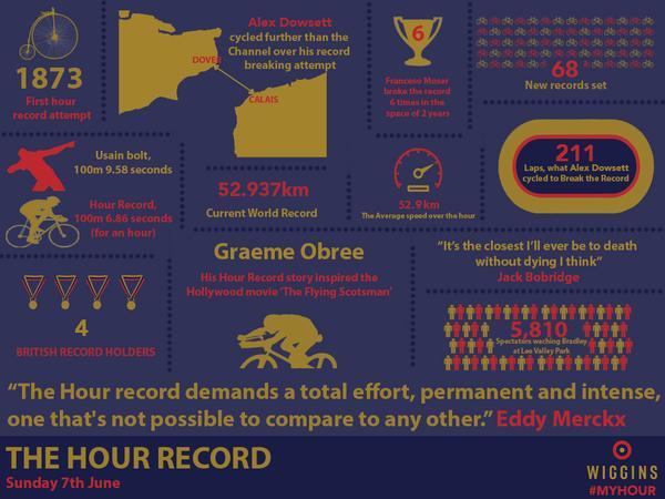
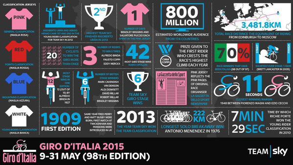
With a fortnight to go until Sir Bradley Wiggins attempts the UCI Hour record at the Lee Valley VeloPark in London, Team Wiggins has released an infographic charting the history of one of the hardest feats in cycling. But Team Sky, which Wiggins rode for until last month, aren’t happy about it, pointing out how similar it is to their own infographics.
With Team Wiggins sharing many of the same sponsors as the WorldTour outfit – Pinarello, Rapha, Jaguar, and Sky itself – some might assume that they were the work of the same designer, and that the Hour record infographic was meant to be similar in style to earlier Team Sky ones.
Not so, says Nick Howes, digital manager at Team Sky, who described it as a “blatant rip-off” when he tweeted the two infographics side by side earlier today.
I've never seen a more blatant rip off of Team Sky Infographics than this from @OfficialWIGGINS! #SpotTheDifference pic.twitter.com/ezve3vQh7V
— Nick Howes (@TeamSkyNick) May 26, 2015
Here they are so you can judge for yourself.


Granted, there are only so many ways you can present this type of information, but Howes does seem to have a point. Both have a dark background, with text in colours mainly based on the respective teams’ kit, plus a splash of pink and the Italian tricolore flag for Sky.
Both use a similar font and style of graphics, and the positioning of the title at bottom right and team logo, bottom right, is identical.
Scott O’Raw of Velocast was among those who were surprised at Howes’ tweet, with the Team Sky staff member explaining his opinion to him.
@velocast @OfficialWIGGINS nope, absolutely not. We worked hard on those as well. Poor, poor form
— Nick Howes (@TeamSkyNick) May 26, 2015
Not everyone had a problem with it, however.
@TeamSkyNick @OfficialWIGGINS Hardly a unique idea, putting info into a collage! Given what Wiggo gave to @TeamSky you shd be happy to share
— Linda Billett (@Thehenlady) May 26, 2015
The Hour record is currently 52.937km and is held by Alex Dowsett of Movistar, who set it at the start of this month in Manchester.
Wiggins’ attempt on it takes place on Sunday 7 June and will be broadcast live by Sky Sports from 6pm-8pm – including free on its YouTube channel – with the ride itself starting at 6.30pm.
Latest Comments
- Rendel Harris 3 sec ago
That wouldn't be new, more than twenty years ago my insurers tried to avoid paying out on the theft of my motorcycle on the grounds that I couldn't...
- Pub bike 4 hours 15 min ago
The highway code doesn't say "If you are approaching a cyclist from behind sound your horn"....
- Disgusted of Tunbridge Wells 6 hours 42 min ago
Erm... You forgot to mention The Tyne Tunnel opened in 1951!!!...
- Destroyer666 7 hours 14 min ago
Always? So the guy is asked to appear on a podcast to discuss performance enhancing drugs and answers questions posed to him, which go beyond what...
- David9694 7 hours 33 min ago
"Babergh District Council said it had been "clear throughout" that it "had no option but to introduce charges" and could not afford to continue to...
- KDee 11 hours 29 min ago
I'm still running an ELMNT BOLT V1, and I've never really understood the LED's. I'm sure I configured them for HR zones, but never really look at...
- don simon fbpe 12 hours 54 min ago
Why is this not the will of god?
- hawkinspeter 15 hours 58 min ago
PKD foresaw it, though his novel was based on a different outcome of WWII, not the precursor to WWIII. Maybe the Idiocracy film is a closer fit?
- OnYerBike 18 hours 34 sec ago
@Sredlums: I'm not sure I follow your logic. If someone grabs your helmet twists it, then the reason it doesn't feel good is because the outer is...
- Rapha Nadal 18 hours 45 sec ago
Coming to the mid-paced Saturday club ride soon.
Add new comment
41 comments
Skys look rather like this 3 year old infographic....
http://bijoor.me/files/2013/05/CyclingGraphic-01.jpg
The Wiggo one's a bit clumsy in places so I'd say Team Sky have a better designer. Bit of a non-story though.
team sky nick is a di%K. Like Rapha never copied anything!
Undergarments need unbunching I think. I quick google of "cycling infographics" brings up loads of them, all very similar:
http://bijoor.me/files/2013/05/CyclingGraphic-01.jpg
http://www.bikehub.co.uk/wp-content/uploads/2011/05/LoveHateTravel.jpg
http://4.bp.blogspot.com/-Dt43B7dgO8E/UoZPTuKwY7I/AAAAAAAABf8/fTEMJyYita...
http://the-way-to-the-centre.com/blog/wp-content/uploads/2013/04/infogra...
It's an infographic. That's where the similarities end.
Most branded infographics use their recognised colours. The only similar feature is the dotted lines acting as borders - that's hardly unique to Sky though.
Using Sky's logic, I can only assume they blatantly copied Intel's infographic, and made it landscape instead of portrait:
http://www.intel.co.uk/content/dam/www/public/us/en/images/illustrations...
I can only guess that the Sky bod that whinged is so wrapped up in his own little world ( many sports bods are) that he doesn't realise the limitations of the infographic form when it comes to variations.
i thught they were just like red bull and toro rosso a convenient way of british cycling to split its pro track riders into pro squads appropriate for Bcs need
I'm just pleased that having announced the current hour record as being 52.9km they then followed this up with an 'Average speed over the hour' of 52.9km/h. Phew- saved me working it out.
Will Team Sky be riding Specialized bikes next year? Their corporate cultures seem well aligned if this is anything to go by.
Indeed, except that the graphic states the average speed was "52.9km".
It's definately a rip off though.
Storm in a teacup. Doubt anyone has the right to solo use of small circles for borders and the graphics themselves are all pretty much different.
Pages