

- News
- Reviews
- Bikes
- Components
- Bar tape & grips
- Bottom brackets
- Brake & gear cables
- Brake & STI levers
- Brake pads & spares
- Brakes
- Cassettes & freewheels
- Chains
- Chainsets & chainrings
- Derailleurs - front
- Derailleurs - rear
- Forks
- Gear levers & shifters
- Groupsets
- Handlebars & extensions
- Headsets
- Hubs
- Inner tubes
- Pedals
- Quick releases & skewers
- Saddles
- Seatposts
- Stems
- Wheels
- Tyres
- Tubeless valves
- Accessories
- Accessories - misc
- Computer mounts
- Bags
- Bar ends
- Bike bags & cases
- Bottle cages
- Bottles
- Cameras
- Car racks
- Child seats
- Computers
- Glasses
- GPS units
- Helmets
- Lights - front
- Lights - rear
- Lights - sets
- Locks
- Mirrors
- Mudguards
- Racks
- Pumps & CO2 inflators
- Puncture kits
- Reflectives
- Smart watches
- Stands and racks
- Trailers
- Clothing
- Health, fitness and nutrition
- Tools and workshop
- Miscellaneous
- Buyers Guides
- Features
- Forum
- Recommends
- Podcast
feature


Your cut out and keep guide to 2014 WorldTour team kits
The 2014 race season is about to start and all 18 WorldTour teams have now revealed their new jersey designs. For some teams it's a complete fresh start, others have changed their kit very little from last season.
A trend has emerged: black is very much in fashion this year. Trek Factory Racing, Omega-Pharma and Giant-Shimano each revealed new kit with a predominantly black design. It's so slimming after all... not that most pros need any help in that department. Some are blaming Sky for this trend. However, blue is still a popular colour choice in the peloton, and green and red even get a good showing. Tinkoff get the award for the brightest kit. It really needs to come with some sort of warning.
Most squads retain the same title sponsors as last season, or add a couple of new smaller sponsors. There are a few big changes though, Trek stepping up as sole title sponsor of the former Leopard-Trek team and Giant replacing Argos to form the new Giant-Shimano team.
AG2R La Mondiale
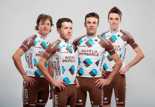
AG2R La Mondiale keeps its white and brown kit for another year; there really aren't too many sports team kits that are predominantly brown, are there? Little change for 2014, just a bit more brown on the jersey so the overall effect is that it’s a little darker than before. It certainly stands out, and it might just be me but I think it has grown on me. Mullets are entirely optional, down to the discretion of the individual riders.
Astana
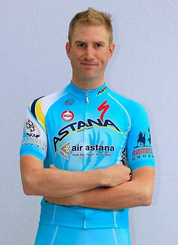
You either love or hate the Astana kit... or possibly have no strong feelings either way. It's only been tweaked for 2014, sticking with the baby-blue hue and adding in some odd yellow/white fades along the shoulder and around the back. The Astana logo, now blue rather than white, still swoops over the chest, and they’ve crammed a new sponsor in below it. It’s still a mess.
Belkin Pro Cycling
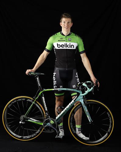
Green, white and black, the corporate colours of Belkin, who in case you don't know, is a huge manufacturer of wireless connectivity products - routers and stuff. Colour aside, it's quite a traditional design, with the white horizontal band framing the title sponsor. The green shoulders will make Belkin riders easy to spot in the peloton. Does the Belkin green go well with the Bianchi celeste? Well, that's questionable at best. In fact, let's be honest: no, it doesn't.
BMC Racing Team
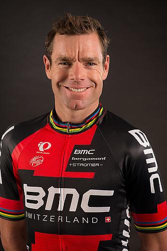
BMC, the lazy so-and-sos, haven't bothered to design a new strip for 2014. Instead they're sticking with the 2013 kit, a red and black design with large intersecting blocks; a sort of pixilated look. The good news is that if you bought a replica kit last season, it's still current this season, which will please the thrifty among us.
Cannondale Pro Cycling
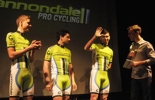
Like BMC, Cannondale don't appear to have made any changes to their kit, sticking with the lurid green with white side panels and odd vertical stripes above the waist. I'm not a fan, but you have to admit that it's distinctive.
FDJ.fr
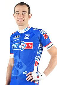
The French team switched from white to blue last year, a move which shocked many ('shocked' might be a bit strong, thinking about it). They're sticking with the blue kit again, and don't look to have made any significant changes this year - you can't go nuts every season. A good looking jersey and easy on the eye, and refreshing in the sea of mostly black jerseys that seem to be dominating the sport this season.
Garmin-Sharp
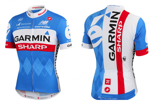
No major change for Garmin-Sharp. From the front it looks identical to last year, the same argyle on blue with white and red bands. The back has been totally revamped, however: a huge slab of white with vertical title sponsor logos and, if you squint closely, you'll spot the tiny World Wildlife Fund logo. Anyone remember Dan Martin being chased by a man dressed as a panda at Liege-Bastogne-Liege last year?
Giant-Shimano
![]()
What can we say about the Giant-Shimano kit? The designer had a penchant for liquorice allsorts? Giant’s brand styling includes a lot of black, white and blue, and that is mirrored in the kit. There’s still time for it to grow on us. Howay the Toon!
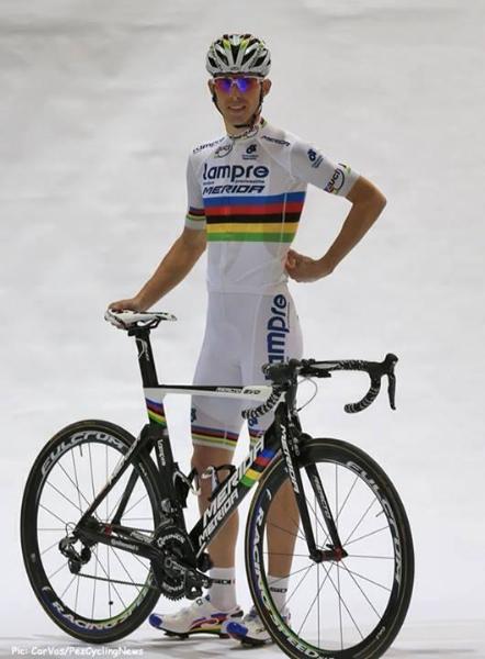
Lampre-Merida
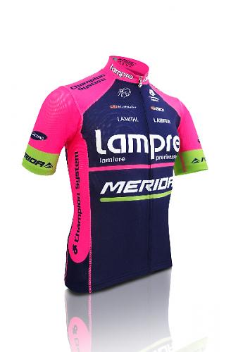
Who'd have thought that pink, green and blue would complement one another to make a beautiful jersey? No one, that's who... and they'd be right. Thankfully, the Lampre-Merida kit has been toned down just a bit for new season. Mind you, it's all relative. There’s more blue, now darker, and less fuschia, now relegated to the side panels, sleeves and shoulders, with a green stripe on the sleeve. The change makes it a little less shocking than the 2013 kit, which for many was the ugliest mashup of corporate colours in the peloton. A move in the right direction.
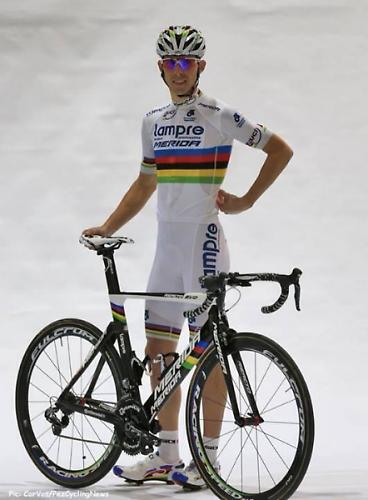
Lampre-Merida also have the world champion Rui Costa so they’ve produced a white jersey with the rainbow bands around the torso and on the sleeves. Unfortunately, it looks like Rui Costa will be donning matching white shorts for the season, with custom painted Sidi shoes and Merida to match. Let's hope it doesn't rain for the entire season, then.
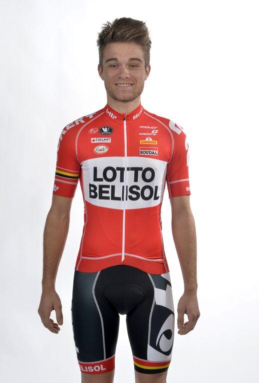
Lotto-Belisol
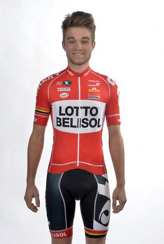
The most shocking change to the new season is Lotto-Belisol. The Belgian squad has ditched the white, blue and yellow design, and replaced it with an all-new red jersey and black shorts combination. We’re not sure what’s going on with the font used for the main logo across the chest panel though. Looks like the designer forgot to send the printer the font file. The team claims the new design celebrates “the 30 years of Lotto tradition in cycling with a basic retro look.” Hmm... The back of the jersey is very spartan with a lack of big logos, so should be easy to spot in the peloton.
Movistar Team
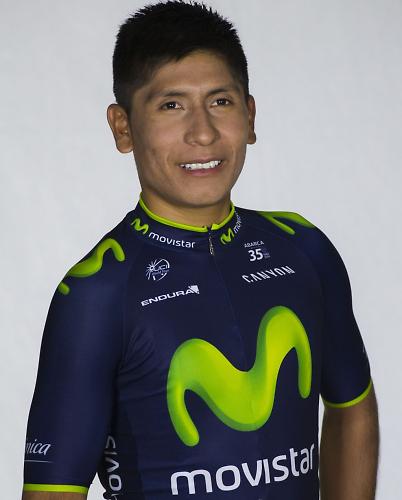
Despite a change of clothing manufacturer, there's little change in design for Spanish team Movistar. It's starting to look a little dated now, we reckon. The team enters its first year with Scottish clothing company Endura, who released details of the new kit a little while ago. They told us that they’ll be selling kit that is identical to the kit the team wear. They’ll be selling the full head-to-toe strip, and it’ll be available through its network of dealers.
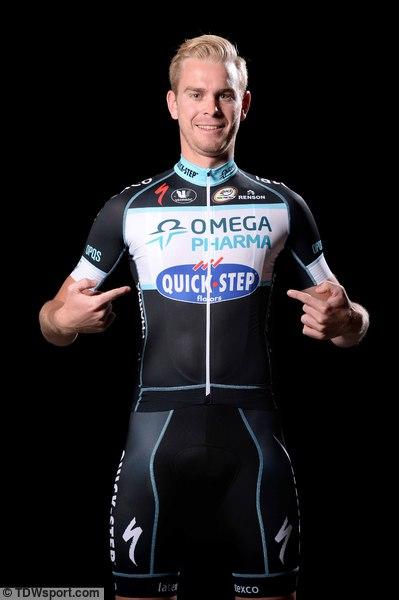
Omega Pharma-Quick Step

Mark Cavendish’s squad has been borrowing from the Team Sky paintbox this season, with a greater use of black on the jersey. They also dropped the gradient fade from the shoulders. I’m not sure it's an improvement. Black is slimming, right?
Orica-GreenEDGE
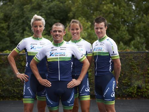
The Australian team has made a few tweaks to its kit, and it’s much cleaner and better looking for it. The most noticeable change is the tall green band has slimmed to a thin stripe, and it now sits higher up. It divides a large blue lower panel and white shoulders. It’s still identifiably Orica-GreenEDGE, even though the main logo is quite a bit smaller.
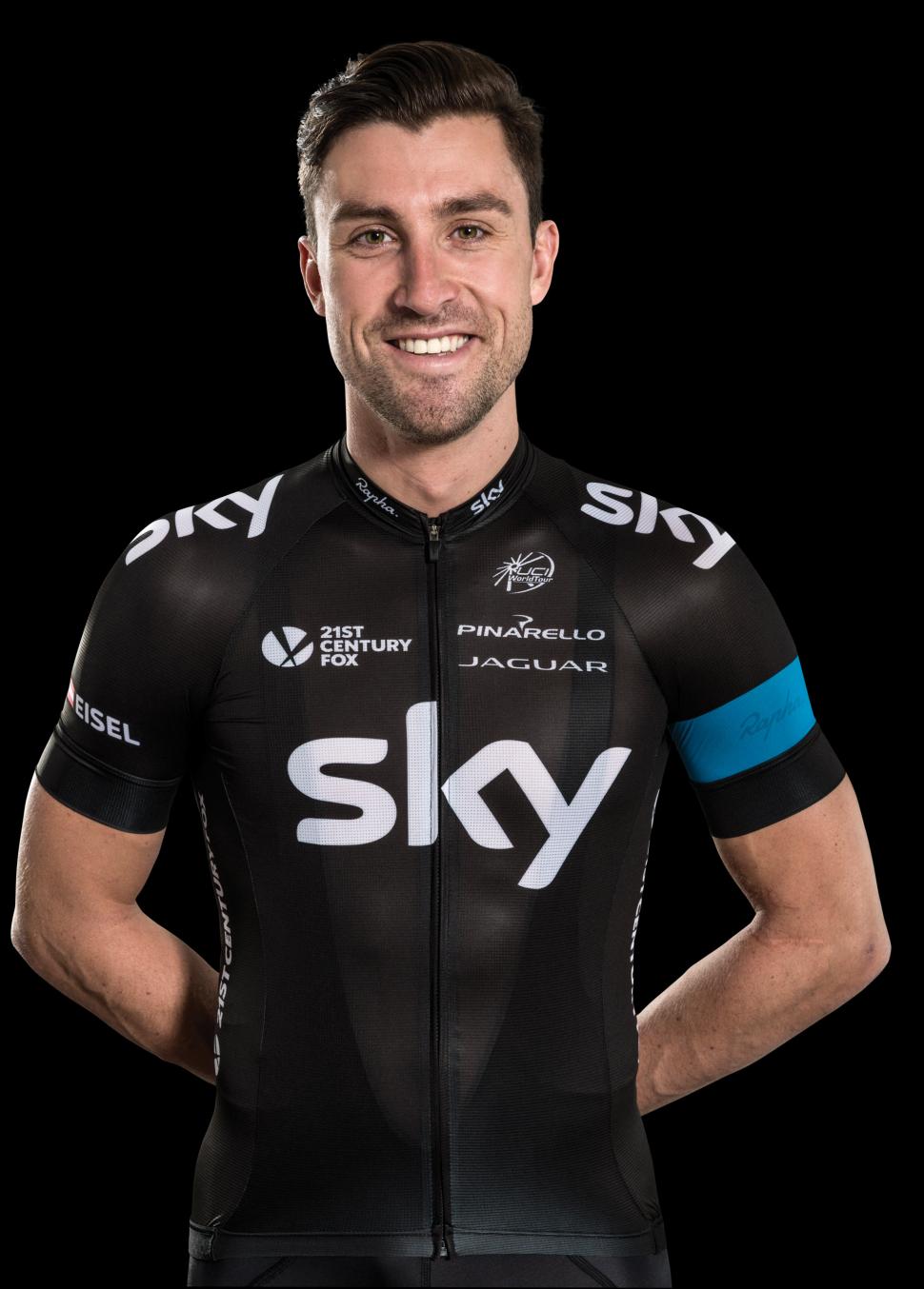
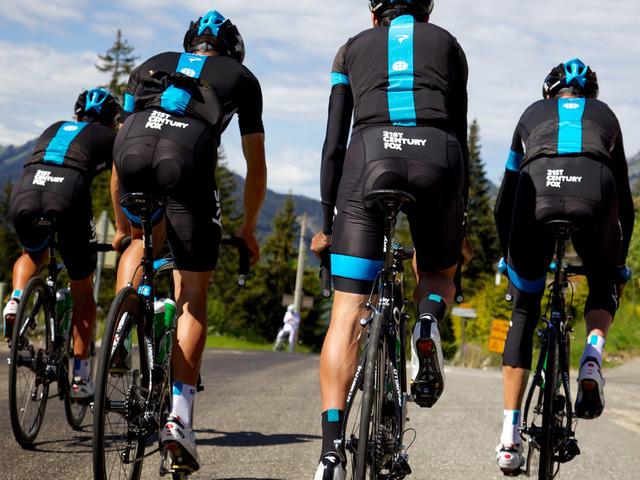
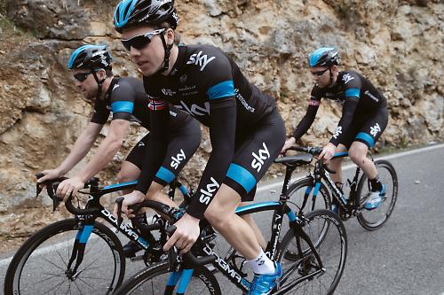
Team Sky
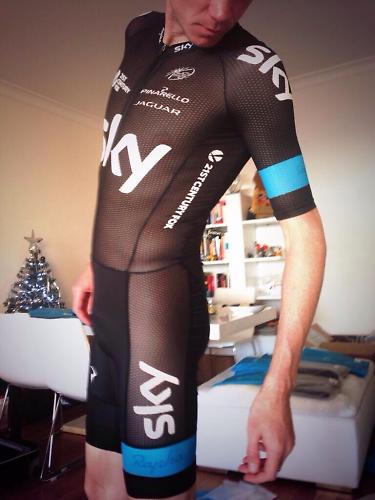
Oooh, cheeky! Chris Froome caused a commotion on social media when he tweeted this photo of the new Rapha skinsuit. It's an extremely see-through fabric. Thank goodness for that modesty panel. Looks like they're making a short sleeve jersey from this fabric as well, which the Tour Down Under team have been spotted wearing.

Here's the official photo of the new jersey. The design, in a way it has changed little, but one big change is the loss of the rider names from the side panels. They're now found on the arm sleeve, and the side panels are now filled with a 21st Century Fox logo, joining the one that appeared on the shorts last year. Jaguar has been given a spot on the front.
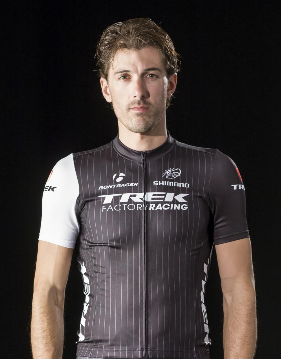
Trek Factory Racing
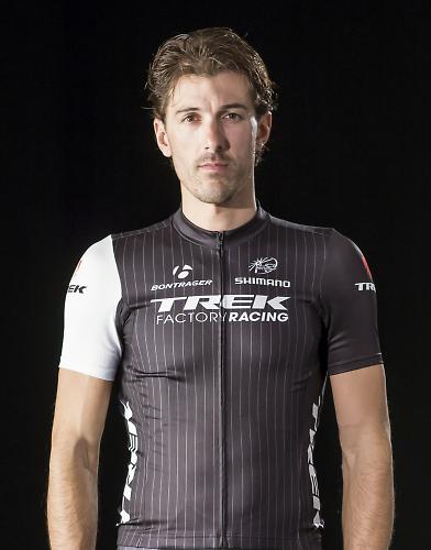
Pin stripe suits, yes, but pin stripe cycling kit? That’s a new one on us. Trek have stepped up as the sole title sponsor with its Trek Factory Racing team this year, and thankfully that means the clash of Radioshack red and muted Leopard tones can no longer offend our eyes. The Trek kit is understated. Corporate? Plain? Boring? We can see it being a hit with fans though. And pin stripes are slimming, no? Spartacus looks a bit non-plussed by the whole thing though.
Team Katusha
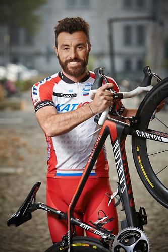
Remaining with red as the main colour, Katusha have added a large white chest panel to the kit this year, with ‘IO’, taken from the Katusha logo, repeated in lines across it. Not an improvement on the 2013 kit which was mostly red with a white band, or the 2011 kit with the city skyline printed across the chest, in my opinion. Something about this picture makes us think, 'The best a man can get'.
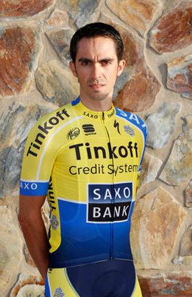
Team Tinkoff-Saxo

Mind your eyes! With Oleg Tinkov buying the team outright over the winter, the latest kit goes big with yellow, the corporate colour of Tinkov’s bank. Will it be the only yellow jersey that Alberto Contador wears this season?
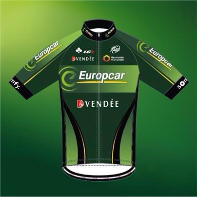
Team Europcar

Little change for Europcar, it’s still an interesting shade of green. A bit less black in the side panels and a couple of black curved lines on the lower half are the main changes, otherwise it's business as usual.
There you go, the 18 WorldTour team jerseys. It's not a classic year for professional cycling team kit, but there are a couple of interesting designs.
Remember, the job of a team jersey is purely functional, to act as a platform for advertising sponsors, so it's a bit unfair of us to take the Mickey. That said, where's the fun in playing it straight all the time? With the constraints from corporate style guides that most big brands have, there's little scope for creative flair to show through. You don't get much more compromised than a trade jersey.
Which is your favourite? Let's hear it in the comments below.
David worked on the road.cc tech team from 2012-2020. Previously he was editor of Bikemagic.com and before that staff writer at RCUK. He's a seasoned cyclist of all disciplines, from road to mountain biking, touring to cyclo-cross, he only wishes he had time to ride them all. He's mildly competitive, though he'll never admit it, and is a frequent road racer but is too lazy to do really well. He currently resides in the Cotswolds, and you can now find him over on his own YouTube channel David Arthur - Just Ride Bikes.
Latest Comments
- essexian 1 sec ago
That's strange. It really should have a dashed line like it did until 2014 according to Google Maps....
- Rendel Harris 11 min 22 sec ago
Judging by Mrs H's admiring remarks about Mr Del Toro's abdominals, it certainly didn't damage the image of the sport in this neck of the woods!
- Safety 21 min 9 sec ago
"So are you saying that he was driving without insurance because his sister was married to the former FM?". No that's not what I was saying....
- half_wheel79 23 min 44 sec ago
Don't sweat it, as long as you are enjoying it thats all that matters, certainly some turbo work will help, you'll see some impressive gains over...
- andyk 31 min 3 sec ago
Keep going road.cc and keep the pressure up with the police....
- dubwise 1 hour 15 sec ago
Glad you thought the roads were fantastic, can you share where you were please?
- chrisonabike 55 min 26 sec ago
It would be best if motorists had to push the button; but the red light has already come on for that idea ("What about emergency vehicles /...
- brooksby 1 hour 56 min ago
Good lord! Is this argument still going on...?
- brooksby 1 hour 57 min ago
"No true Barton Hill-ite..."
Add new comment
21 comments
AG2R kit has always been pleasing to my eyes. Kind of gentlemanly, and always easy to spot in the pack because no one else goes for brown.
If sky wear that semi-transparent skin suit style jersey in the TDU, there should be some interesting sunburn on their pasty white English/Euro skin, and it will be very uncomfortable for days 2,3,4.....
Those Aussie riders look a bit girly...
Why is Dennis Quaid posing in BMC clobber?
I very much ike the OPQS kit. Dislike the Sky kit. Not too keen on pinstripes either - odd, I work in the City...
I've always liked the ag2r kit.. .
To me pinstripes say clean and professional.. Maybe that's a subliminal thing. Garmin have exploited the 'advertising from above' thing. Dunno why most teams don't do this. And have rider names printed across the shoulders.
And I'm gutted that argos aren't virginal white anymore.
Lotto Belisol is nice
Helvetica-y
hate, hate, haaate Astana kit
it offends my eyes
although i really do like the Ag2R, weird huh
Am I the only one who looked at the AG2R La Mondiale picture above and thought 'poor sods, I hope their mums love 'em'
Seriously, the Ag2R kit is growing on me. I only think this is possible due to the absolute dullery that is the rest of them, Lotto belisol aside.
Not World Tour but IAM cycling's kit is by far the best of the bunch this year, it's lovely. The award for ruining a good thing has to go to Neri Sottoli who took the ace Vini Fantini kit and added every other fluro colour in the swatch selection. It looks like a Newfoundland has eaten a four pack of highlighters and shit them onto a T shirt.
Belkin were on a hiding to nothing once they signed with Bianchi.
Their bikes should only ever be celeste and the corporate Belkin green is a different shade...
I don't really like any of them, last year Belkin was okay but I much prefer older jerseys before they were over sponsored. In my opinion a lot of local teams have more interesting kit than this lot.
Not looking forward to seeing the replicas of that Sky fishnet thing being ridden around in size XXL!
None for me this year thanks. I am still trying to get the London 2012 GB jersey off ebay. Now that is a team that has earned some support.
Poor old AG2R - La Mondiale...still being forced to wear those god awful brown shorts (surely the REAL reason why Nico Roche decided to seek pastures new a couple of years back)!
Why, Garmin Sharp aside, are cycling teams seemingly so reluctant to release promo photos showing the reverse of the jerseys, given that for the majority of a bike race that is what is going to be on show to viewers?
When did Katusha sign Hugh Jackman?
Why does Alberto Contador's facial expression look like Dave Chappelle doing Prince?
My main criteria for kit is whether it helps pick out riders in a bunch, followed by the more aesthetic questions of design and colour. It's why the Vini-Fantini kit was so fantastic.
On that basis it's hard to judge until you see them in a race, but I quite like the Giant kit as a first attempt - I think the B&W contrast stands out, although the previous Argos kit was one of my favourites. They should have gone back to something like the old Skil-Shimano jersey but in Giant friendly colours. Others on the good side:
Sky
Europcar
Movistar
Lampre
Belkin (although their bikes are a crime against cycling)
Lotto (who forgot to get someone to design matching shorts)
AG2R
BMC
Garmin
Katusha
Tinkoff
Cannondale
On the other side OPQS gets low marks - the kit looks good in the photo but will disappear in a peloton. Why ditch their reasonably distinctive blue colours ? The other Indistinguishables I reckon are:
Trek
OGE
Astana
FDJ
Lotto & Europcar probably the best there, and Sky's non-skinsuit still looks good. But the rest are fugly.
Chris Froome looks like a groupie at a Motley Crue concert (minus the poodle perm).
Trek and BMC are the best of a very bad bunch.
With you here! Though I do sort of like the new more black OPQS kit too.
Lotto is the best by a mile IMO!